Signature Capture control
Description
The Signature Capture control is used to capture a signature in an application.
Discussion
A common requirement in mobile applications is the ability to capture a signature and store the signature in a database. The Signature Capture control can be used to add this functionality to a mobile application.
To add a Signature Capture control to a UX component, select the control from the 'Data Controls' section of the toolbox.

You can then define properties of the control in the property grid.
The signature control contains two HTML elements, only one of which is visible at any time:
- a canvas control for capturing the signature
- an image control for displaying previously captured signatures
For example, in the image below, the signature capture control is showing a previously entered signature, so the image element is displayed.
The 'Sign' button that appears below the image is a built-in button (i.e. it is automatically generated by the Signature Control - you can optionally turn it off).

When the user clicks the 'Sign' button, the 'Image' element that displays the signature is hidden and the 'Canvas' element (where the user can sign) is displayed, as shown in the image below:
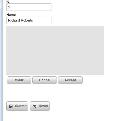
The 'Clear', 'Cancel' and 'Accept' buttons (like the 'Sign' button in the previous image) are automatically generated by the Signature Capture Control. Like the 'Sign' button, you can optionally turn off these buttons and add your own buttons to control the Signature Capture Control. The buttons perform the following actions:
- Clear
Allows the user to clear the signature they have entered and start over.
- Cancel
Switches back from 'signature capture' mode (where the 'canvas' element is shown) to 'signature display' mode, where the existing signature (if any) is shown.
- Accept
Accepts the signature that was entered and switches back to 'signature display' mode.
The image and canvas elements that make up the Signature Capture control are contained within an outer container. When you define the properties of the Signature Capture control you specify the dimensions of the outer container separately from the dimensions of the signature capture area.
The dimensions of the signature capture area must be smaller than the dimensions of the outer container (because the signature capture area has to fit within the outer container) and must not use percentage sizes. For example you can't set the width of the signature capture area to (say) '80%'. The reason for this is that you never want the signature capture area to resize (for example, when the orientation of a mobile device changes), or else a signature captured when the device was using (say) portrait mode would look distorted when you were in landscape mode.
Storing Signatures in a Database
When the user submits the UX component, you can store the signature that the user entered in a field in a table. The signature control must be bound to a binary field. When the UX component is submitted, the value in the signature capture control is submitted as a base64 encoded PNG image. The value is converted to a binary value before it is stored in the table field.
Customizing the Signature Capture Buttons
The property sheet for the Signature Capture control allows you to turn off the system generated buttons. Uncheck the Include buttons to toggle between capture and display mode to turn off the built-in Signature Capture buttons. If you do this, then you must add your own buttons to handle capturing the signature. Here is the JavaScript code that each button must call. Replace signatureControlId with the name of the Signature Capture control:
Sign Button
{dialog.object}._functions._toggleCanvas(signatureControlId,'canvas');
{dialog.object}._functions._clearCanvas(signatureControlId);
Clear Button
{dialog.object}._functions._clearCanvas(signatureControlId);Cancel Button
{dialog.object}._functions._toggleCanvas(signatureControlId,'image');Accept Button
{dialog.object}._functions._saveCanvas(signatureControlId);
{dialog.object}._functions._toggleCanvas(signatureControlId,'image');
Where signatureControlId is the id of the control.
In order to hide the 'Sign' button when the 'Clear', 'Capture' and 'Accept' buttons are shown, and vice versa, you can hook into the 'onSignatureCaptureToggle' client-side event.
Validating Signature
A common requirement in a UX component is to validate that the user has signed the form when the UX is submitted. You can check that there is data in a signature capture control by adding code to the server-side dialogValidate event. When the UX is submitted, the signature (in base64 encoded form) will be submitted in a special hidden field with the same name as the signature control and a '_HIDDENA5FN' suffix.
The following code in the server-side dialogValidate event will check to see that the user has signed the UX (assuming that the signature control was called 'SIG':
function dialogValidate as p (e as p)

    dialogValidate.hasError = .f.
    dialogValidate.errorText = ""

    if e.dataSubmitted.SIG_HIDDENA5FN = "" then
        dialogValidate.hasError = .t.
        dialogValidate.errorText = "You have not signed the form."
    end if

end function
Videos
Using the Signature Capture Control
A common requirement in mobile applications is the ability to capture a signature and store the signature in a database. In this video we show how this is easily achieved by placing a Signature Capture control on a UX component.
See Also